
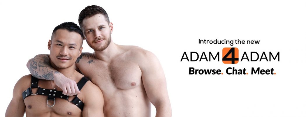
The New Adam4Adam App is Here
Hey, guys! We are happy to announce that the all-new Adam4Adam app is finally here! And yes, it is 100% free as always.
We’ve completely rebuilt and redesigned the A4A app in order to provide you with a better, faster, and more engaging experience. And, unlike other gay mobile social apps, we have no restrictions on our features. It means you can use all the features for free, making it even easier for you to meet new guys. That being said, here are some of the new features that you can expect in the new version of our mobile location-based gay app.
The latest Adam4Adam Radar—available for both the iOS and Android devices—features Adam4Adam’s newly restyled logo and branding, a sleek new aesthetic, an optimized user interface, and many improved or new additional features created solely to help you find your Mr. Right or Mr. Right Now.
What do these changes mean for you?
With the 25 free filters, for example, you can search who among the A4A users are top, bottom, or vers. You can also filter by who (trans, men, couple); sexual orientation (gay, bi, straight curious); relationship status (polyamorous for example); looking for; sexual practices; and communities to name a few. Although please be reminded that for the filters to work, your profile must be updated. If your information is not complete or not up-to-date, then you will not be found by other A4A users. Because of lack of information, you might not come up in their search.
On the other hand, the new five grids on A4A Radar allows you to browse guys through various categories like who’s Visiting, who’s Near Me, who’s New, who’s Featured, and who’s Popular. The “Popular” category simply shows you the guys who received the most Smiles in the last 24 hours!
Of course the messaging system has also been improved. It now enables you to unlock your photos to other users, send photos, location, and it also saves your favorite sentences, to speed things up. Tell a guy you like him by sending him a smile or add guys in your favorites list.
You will notice that your profile now looks different from the older version. It shows your distance, when you were last seen and when you were last online. Other Adam4Adam users can now also easily view your multiple photos and yes, you can even add your social media outlet if you want to show other users other sides of you.
These are just some of Adam4Adam Radar’s new, fresh features and of course, you can upgrade to VIP to remove ads and on top of the aforementioned features, with VIP you can:
– Browse discreetly using the Invisible Mode
– Get listed in the Featured Members grid
– Upload more photos in your profile
– Get unlimited favorites and blocks
- Get priority support and skip ahead of the queue
- and more
So, what are you waiting for? Hurry and download Adam4Adam app from Google Play for Android and from iTunes Store for iPhones.
Let us know below how you like the new app too and if you have constructive criticisms. Happy dating, guys! And thank you for always using Adam4Adam, this is for you!
Love the new interface but it won’t let you scroll pictures and wouldn’t let me crop or add a new picture (because you couldn’t scroll to click “done”)
Thanks for the upgrade!
i musclebearnky, I can upload a new picture on my side. When you click on the “camera” icon on your profile, just click the + and select your photo. It scrolls perfectly for me. Can you give me more info?
How do you log out of it?
Other than that, it looks and behaves great.
Click on your profile, click top right icon, scroll down to my account, then log out.
How do you log out of it?
Otherwise, looks and works great.
Hey, you auto log out after x minutes of inactivity
It’ll log you out after two and a half hours of inactivity BUT if you’re on iOS it will occasionally log you back in. Even if the app is in the background, or force quit completely!!
You can logout when you go in “my account”
I don’t like it please don’t change.
Sorry that you don’t like but it’s the new app, try it again and check all the new functionalities…
You can now send photos, send location, send saved phrases, you can filter guys by sexual orientation, by sexual preferences etc… Much better
What is going to happen with my actual settings, block list…? Do I have to do that again?
it stays the same. But we added so many things in “edit profile” you should check one by one.
I have a Microsoft phone, therefore I think it sucks! Can’t even use the web version! will never be a sheep and use an Apple phone and don’t care for droid
u can use mobile website, m.adam4adam.com we released the beta version to 10,000 users, so if you want you can try.
Will it be available without the app like on a laptop or for someone who doesn’t want the app on their device?
adam4adam.com the new site is up as well…
I’m confused the internet version on my phone, doesn’t appeared to have changed. Is mobile version still using the same website, ie adam4adam.com?
if you go on m.adam4adam.com from your phone, you can see the top banner that suggest you to try the new version. Just click the button 🙂
There was a previous upgrade, maybe a year ago, that I tried and didn’t like. It allowed you to return to original mode. If i try it and don’t like it (can’t get used to the new system) can i return to original?
No, you have to get used, it’s an update. Previous update was really bad, this one is amazing compared.
It’s funny you admit the update before was bad, they asked for NO feedback, the color scheme and reloads was horrendous for my eyesight, and I begged to go back to the subtler original as there had been a short window to return. I got a terse and nasty reply from A4A support and that was the last time I paid for service. You guys really are the best of the bunch, so why not ask for input?
sorry about the reply you got… I’m surprised because our team is briefed regularly about giving good service.
Everyone is welcome to give their opinion on our products and we listen to you guys.
Ever time you change the access there is electronic short. When you changed last time to new logo took me months to learn how to use it
sorry for that, but the app is very user friendly, and this update was well needed. We know it can be hard in the first few days, but after few times, you will know already.
When I filter, the results are not shown by closest to me. That defeats the purpose.
Ok, thanks I will advise the dev for this.
It took some getting used to but for the most part the experience is more ‘friendly’, from an iPhone/iPad users standpoint anyhow. About the only thing I don’t like is that a message is auto-created when I re-lock photos. A lil OCD, a lil F-you!, if I relock I prefer to do it under the radar. I don’t necessarily like the snark that can and has followed when someone was offended that a guy they had no interest in relocked their pics.. Otherwise, appreciate the continued improvements.
Ok thanks for this Andy, I will advise the dev, you are right.
I HATE IT!!! I HATE IT!!! I HATE IT!!!
why?
For one thing it’s slow af.
the app is slow? What do you mean? It’s like 10x faster than the previous one…
Tried to load it. It’s not compatible with the Android device I have. Haven’t had issues with any other Apps. A4A’s current PC-based site works fine on my phone and other devices so I’m good as is. Tried the new PC version, but wasn’t into the black background and small white text. And the tiny links made navigation problematic so went back to the previous version.
You have 2 color choice for the website. Dark theme, white theme. Check on the top right of “Members online” page.
As for the font, we didn’t make them smaller.
Dark theme/light theme .. the unchanged standard one is easier to view. And regardless when the text and links were last charged, they’re problematic for navigation. I’m good to go without switching.
Do agree with SFTONY229 … multiple clicks in order to log out are not user friendly. And relying on an autologoff timer is bad practice.
The logout on the desktop is exactly at the same place, so I don’t know what you mean.
I also suggest to start using the new version of desktop and mobile website as we’ll move everybody on the new one very shortly.
too hard to change cities around where I live takes too long to change where as before you had the cities in a drop down.. Ill give it a week if not easier to navigate I will move on to other sites.. just not worth my time to search for a hook up..
How about some new features for the online version like:
An inactivity indicator that would show us who is on but not really there.
A gotta have it now feature to find another horny man who wants it now without having to sift through all the profiles.
You can turn on the “online” switch.
You will see only the online guys.
Does it still block photos/profile pics that it deems “inappropriate” from appearing? If so, then it’s still useless.
Mag, of course it is, it’s Apple’s and Google’s policy, it has nothing to do with A4A. There’s kids downloading apps and all apps are g-rated in the stores.
Users need to click back to the main page, then to their account, then scroll down to the bottom, then click to logout No other site I’m on requires this many steps. Logout links are usually placed in easy view toward the top right of main pages. How about by the HELP link or in the far left column?
What are you referring to? website desktop, mobile website? app android ? app iOS?
Website desktop. Don’t need mobile as desktop version works fine on my Android. Can’t download the app.
How come you cant download the app?
As I said earlier in this thread, the download process said it was not compatible with my Android device. Granted, it’s not a brand new device but I’ve not had issues with other apps. I’m good with the standard site version anyway so I don’t the app.
I’m living in San Antonio Texas, it is the 5th largest city in the U.S. but I am totally perplexed why we have this weird 2 city level or tiers. We have the regular San Antonio that apparently only visitors go to and then we have San Antonio -Other where you will find everyone else living. Why are we all forced to reside in the “other-regions of this city. Are there “other” situations for “other” cities?
I’m also kinda a word freak too if you haven’t noticed but why the heck is the contrarian banned for use in a profile. Maybe I’m weird to use a weird but it makes you, adam4adam even more strange to ban such a innocent word.
Hey handsome, I will check with developers, thanks for the mention, I will fix this.
I dislike the new mobile site. There are fewer thumbnail profiles per page. It doesn’t give you the option to see more like the old site. The features or links seem tucked away and not quick to access. The interfaces are bigger, wider, the page feels expanded and more scrolling is involved.
The layout takes a little getting us to… one question… were are the save email messages??
thanks
The only thing I have is the small chat option if it was just a little wider like before it’s a perfect upgrade.
Hey, do you mean when you are on the “mailbox” page?
Or you mean the facebook like chat box at the bottom right ?
I don’t like the new app. I clicked the button to go back to the other version. It does nothing for me
You cannot go back on the app. If you’re talking about the mobile website or desktop website, yes you can go back. You have until October 15th, after that all traffic will be redirected on the new version.
The new app seems to allow many more spam profiles! My “Near Me” screen is filled with random profiles 5000+ miles away. Also, I’m getting error messages when chatting from the app (not web version).
Okay, so you have MANY searchable keywords. QUESTION, when are you going to include POZ/neg? I recall on the last update there was concern that this was discriminatory, however, I have a poz buddy and he WANTS to be able to find other undetectable guys. It seems just a matter of fact now that it would benefit everyone to have this option. Please consider including it as a searchable item, thanks
Hey man, thanks for your message. You can filter under “HIV Status” for positive undetectable already.
Check it out.
The new format just kicked in for me.
1) Can’t find how to toggle to dark screen option.
2) Old format had a link to newest blog post on the bottom of every page of Members Online. I had to go through FAQs to find a link to blo. Can be improved.
-in “members online” page right under the “underwear” tab, is the “dark theme” and regular theme. Very simple to switch it on or off.
-the link to the blog is at the same exact place.
Nope. There is nothing under the underwear tab. That tab is the very last thing at the bottom and it will not move or scroll.
Are you on the NEW website? Send a message to [email protected] and our team will send you where it is.
with this new app how can you tell the difference between a pro add and a regular profile, I have a pro ad and regular ads contact me and tell me they cant see its a pro ad from the app, it needs to show the difference between the two.
I can’t tell the difference between pro ads and regular profiles with this new app why??
I tried it. Here is what I didn’t like:
There is no way to logoff
There is no way to see if you are sharing your location or not, and how do “not share” or “share” it.
I hate I have to go to the website to see pictures on profiles that is NOT displayed in the mobile app. Can this be fixed as the pictures should display on both.
Maybe I just don’t like change but why mess it up. Very confused. Hard on eyes. It basically makes me not want to use it.
Please keep the old mobile website as an option!
The new mobile website is slow and clunky. I only use the iOS App to get notifications of messages, but I browse the mobile site so I can actually see all of the pictures. Your new mobile site (along with the app) exhibit such poor design, horrendous user experience, and slow loading times that I fear that you must not have any competent developers or UI/UX designers on your team. You were aiming for a trendy app but don’t have a clue as to how to make a decent one.
A4A would be nothing were it not for its widespread use by the members who create profiles and are logged in and using the site… it’s because of the critical mass of guys online on A4A that it gets any paid subscribers or even just users seeing all of the ads.
The app isn’t the product! You aren’t the product. Your users/members are the product. Don’t be hostile to them or they might just go somewhere else. If A4A becomes a ghost town, no one will want to use it.
Please make the new site compatible with all devices. Whenever I click on the type message page on a guys profile, the page will just reload and I cant type a message. Also, I cant even see the mailbox page. I had no problems whatsoever with the old site. Just make it so that ALL can use it, like the old version. Otherwise you will lose a lot of members.
Hi Rob, can you tell me what you are using? mobile website? desktop website ? or android app? or iOS app?
I browsed the new updated version. It says it will start Oct 30, 2018. How can I return to the old version?
I’ve had trouble getting into mail while using the mobile app on my phone and nook. Why would that happen?
wtf, like i voted for this new appearance webpage now sucks functionality on ios hosed
what? I can’t understand what you wrote mate
How do you go back to the old version on a desktop?
Thank you
In “My account” but soon everybody will be migrated to the new site.
this new platform is really awful. very “myspace” – too much going on. too many moving parts. it lost its clean functionality. there’s a reason why myspace failed – it lacked the uncomplicated functionality of facebook. on top of all the clutter, where do saved messages go? why do people have to go through the extra step of clicking on their profile to log out and scrolling to the bottom? why is the mailbox relegated to a small column that does not show you how many new messages there are? it does not even color code new messages anymore. why are the pull down menus always accidentally pulling down and getting in the way? i could list all the problems but i think the blog would crash. you had a successful platform. this was change for the sake of change. nonsense change. and it’s not better. it’s just cumbersome now. time to open an account elsewhere.
Hi Mike, the site is almost the same as before, the buttons are at the same place etc. Colors have been updated and also the chat system was made to look like fb. The color code for new message is still there…grey are new ones, black are the one that you have already read.
What are the “moving things” you refer to?
FYI, we’ve seen an increase of traffic and message exchange so I dont why you are comparing us to myspace…But we are still changing things as we go based on the comments that we get, so feel free to send your comments to [email protected]
I agree with this poster. With the new mobile site it seems way too much is going on and manuvering around the site has become a chore. The old mobile version was easy and fun.
The new app is horrible. People will not use it if they don’t like it. Like me. It is too busy and add focused. Not user friendly at all.
New App, when you slide the online button to off line are your really offline, versus going to settings/account/log out or is it the same both places?
Keith, the switch is for if you want to see online users only.
To log out, you need to go in your settings yeah.
The old desktop and mobile sites should of been kept around for the people who didn’t want or feel the need for change. At least bring them back.
I don’t like the new App. It’s too busy and difficult to navigate.
Can I still use the old one?
The app or the website?
The app has way more options than the last one which was old and bad technology.
Sorry that you don’t like it, but soon you’ll see that it is way better than the old one
Removing the ability to revert the UI and FORCING everyone to use the new layout & advising them to ‘get used to it’ does not indicate members are being listened to, btw.
The “new” experience is confusing, tedious and frustrating….especially the mobile site. So much so, I feeling like crying after being on it for 10 minutes.
Hey JM, I wasn’t saying that in a mean way, more like you guys will get accustomed to it after few days on it, like all of us did when we created it. Yes of course some elements will change but please send us in details what you don’t like or like at [email protected]. Saying you don’t like the colors or the models won’t change anything but if you come with precise suggestions and bugs of course we will fix.
Good evening
It really is awful. I’m sorry, I don’t mean to insult, but new features at the expense of the old standards is not an upgrade. There are glitches that need to be worked on.
Hi Benji, what is not working on your side, please let us know and we’ll check it. Many users love the new app.
How does a long time user and supporter access their messages on this new look? Do you have to become a paying member?
Hey, click on “mailbox” its the same place as before, we didnt change it.
On the left side you will see the messages you received, click on one, it will open on the right side, like facebook style.
Why is the new desktop and mobile sites so slow? I have fast internet but it seems as if the login pages just ‘hang’ and take a bit to load. Same goes when I try to check my mailbox. Never had this problem with the former platform.
Everything was a bit slower because we had users on the old platform and users on the new platform. Now that everybody are migrated to the new platform and servers, everything is faster.
This New App is dificulet and I do not like the change
When on mobil it keeps shutting me OUT and ask to Constantly RE Sig-ON
Suddenly my Adam Mobil No longer f
gives me the boxe look of every one On line and near.
Instead it all is Scrollingdown each inf
dividual large Pics to see whos Near online
Not good for driving when stoped at a light
Does NOT allow opening mail as easy as before
usinging Adam4A Between my PC and mobil device it is different and confusing
Sorry not working for me
5sensez
Hi, yes of course the app is not made to be used when driving. On the main grid you see guys “near you”, yes.
Click on “mail” for your email.
Jusntime313 tried mobile version, but currently unable to access desktop version on my laptop or tablet. Given the option to choose between mobile version or desktop version on the adam4adam.com home page, but does nothing when you select either. ???
Hi Robert, can you re-try now?
Where did the saved messages go?
Joe, on the app or website?
on the website
ok, the saved conversations are now shown with a green arrow.
I dont like this new app. Loved the older version. When i go to check out the pro section it looks like it wants me yo make an ad. Not happening. Cant stand the color options. Dark theme is terrible. If A4A decides to change again im outta here. Im old school. I dont like changes
Sorry to hear that, it’s 2019, we needed to update everything, and it’s not going to change for few years for sure.
I disabled and uninstalled my chrome application and the new app will not even open for me.
HELP
Please send a message to our support team, they will help you with this! [email protected]
Message I can’t seem to get access to my inbox nor view my messages. please what’s wrong? Tried downloading the A4A app on google play store but was told it’s not available in my country(Nigeria) please how do I access my account? I get email notifications of messages but I can’t access them. please help!!!!!!