
A4A : Check Out Our New Redesigned Website

Hey guys, we are pleased to present a NEW version of Adam4Adam. We’ve made many improvements to offer you a better experience. We hope with time you will get accustomed to the updated look and improvements. Here are some things you have to keep in mind with the new version of the website:
1. Everything is where it was: all the buttons and sections are at the same place.
2. The account home page now has a preview of your profile and you can edit/upload pics from the buttons there.
3. Blocking now makes the blocked person INVISIBLE!!! (yayyyyy!!!)
4. There are hundreds of small fixes/improvements that you won’t noticed but you will surely enjoy them as you go through the website.
5. The iOS app was updated and went live yesterday, it also has hundreds of fixes and is now iOS 8 compatible.
6. There’s a native Android app coming very soon, we are just waiting for Google’s OK!
If you want to leave your feedback, or if you want to report a problem, on the website or the iOS app, send us a email at [email protected] and we will read ALL of them. We won’t necessarily reply though, so don’t send another email if you don’t get an answer.
Try out the new version of the website in “My Account” section and let me know here in the comment section below how you like it!
To switch back to the old version, you can go to Mailbox Alerts and uncheck “Use new version of the site” and click “update settings”.
Dave
*****Guys, ALL the comments that say stuff like ” you fucking morons why did you change it ?” will be deleted. I don’t need to see this! Suggestions, tips, comments are welcome but for god sake, stay polite! Also the new version has been up for 24h, so we are making improvements when we receive a complaint or a report. Be patient!
I don’t like the look at all, it has way too much negative space. I notice these things being a designer and all. Other than that, it seems to be the same site. I am however willing to give this a shot.
DOES THE RADAR APP HAVE A FEATURE WARNING YOU WHEN YOU’RE IN CLOSE PROXIMITY OF AN EX BOYFRIEND?
🙂
Already sent an email asking if they could possibly reverse my account to the old site. Like Paul, I also think there’s way too much negative space. Everything is just too big and stretched as a loose goose and that’s not good. I like my a4a like my bottom’s hole, small ‘n tight. Please go back to what it was!
as a graphic/web designer I love it!
I don’t mind the change but I was expecting things to be added like the IM feature that you once had, that was such a good way to connect
Looks and works great on iPad. No issues
Awful on iPhone5S (with most recent iOS upgrade).
This new version is not good at all. The old site is much better. NO LIKE AND BIG DISSAPPOTED 🙁
Too much space between pics. Too large!!! Please shrink it down to the size that it was!!!!
I HATE IT!!! This new design is too hard to navigate thru and emails are not working I use my iphone to get on site. I guess I gotta find another site since this isn’t reversible
I’m glad blocked people are now invisible. Can you get rid of the ‘delete trace’ function? I’d like to know if I’m being stalked.
The new look is a big step in the wrong direction. It is just so ugly, stretched out forcing you to scroll more, and the colors and fonts are horrible. I much prefer the old layout. You have what is likely the most popular gay dating site. Don’t shoot yourself in the foot rolling this out.
Loose the dead space! Geez. Makes me feel like scanning the whole page just to not miss anything.
5/10
I hate to say it, but if there is no way to reverse it, I will be forced to cancel my subscription of being a supporter and closing my account. The new site is HORRIBLE!! There are way to many sites to put up with this bull shit. I have been an a4a member since I was 18 (6 years ago) with the same profile. It will suck to loose everyone that knows me there, but worth it by giving you less supporters. I already know others that plan to leave as well. FIX IT!!! It looks like it was meant for a mobile site and the computer can’t load it properly or some shit.
The mobile site isn’t properly optimized it doesn’t seem like. Text doesnt align with the buttons. ios on a 6 plus.
I don’t particularly like it.
I liked not having any NSFW image directly when I log in, but now, with the preview of my profile and all, I get a huge photo of my dick in my face as soon as I sign in.
Makes it harder to go peek when with company.
Also, everything seems…clunky(?).
That’s probably not the right word to define what I mean, but whatever.
Also, the blocked person disappears?
On both ends? If I block someone, they’ll disappear for me but they’ll still see me or will I disappear for them too?
And what if I wanna unblock someone?
I guess the best thing about this is that at least everything is at the same spot, so no need for awkward orientation.
ok so I cant go back..there should have been a big warning that said once you push this button..you cant go back..I innocently tried and now regret that I did. I like change but now it takes 5 steps to do what one step did…now Im stuck..you should at least give us some time to absorb the changes,..,,may end up liking some,,,big thing for me is I see less pics now..and when I get an email I have to go out of pics to see just the email..it should all be incorporated on one screen…damn…but all of this doesnt matter because I can to back to old site…not cool
The new look is too white, plus I cannot click and see the members who are online in my area. I would like switched back to the old version.
Yes i agree with paul. And stuff is not in the same place now i have to scroll for miles. it used to all be set up fine Just a little to much tweaking and now just a big mess of a site
Re 3. Blocking now makes the blocked person INVISIBLE!!! (yayyyyy!!!)
He’s invisible to me or I’m invisible to him or both? Better be both
how do I go back?
New layout is a waste of space. Hate it. Nice of the website to force it on us. Guess it’s time to go back to Manhunt.
I agree with Paul about the space thing. Seems to take a little longer to load now. Not sure if it’s because of the space thing or not. And the color scheme?? What the hell is up with that? As Morticia Addams would say… “I can forgive you for all that, but seriously, … Pastels? However, I do like the fact that all the “blocked” profiles are no longer visible and all things considered, I think I could easily get used to it. But these colors are just horrible to me.
When I went to the link it brought up mostly a black screen with some neonish text on the left side. No pictures, nothing. There was a “no thanks” link in the middle but nothing happened when I clicked on it. Accidentally closed that window and cam back into A4A and I guess it is the new site. Agree with the above comments. Will add, the pink sidebar doesn’t fit the orange & black color scheme at all. 🙁
Way too much useless space. Creates too much negative space and no excitement. Has the feel of Manhunt. Updating is always needed, but should be done in manner of not offending or driving people away. I get it, but don’t care for it.
In response to the “There’s no way back guys, so don’t email us for that!”…Why as us what we think if you don’t really care? Just do your deed and be done with it.
Makes sense, doesn’t it?
Is it just me or is EVERYONE having trouble reading messages on their Android phone? When I go to my mail, you can see lines and dates of past conversations but the text isn’t there. Someone should have suggested a “beta” testing. This is SO frustrating. 🙁
I think it’s just fine. I love the layout and the print is larger, making it much easier to read.
The extremely distorted/stretched photographs attached to profiles cause a fair degree of discomfort to one’s eyes.
I have to agree, the presentation is not as good. The boxes are too tall. It’s too big, too much vertical dead space between columns, too clumsy, photos are distorted and stretched. To see the whole page requires scrolling. There is no visual framing, color-wise or ortherwise, as there was on the old site. The mouse-over to get a bigger picture is now distracting vs being helpful.
The thumbnails on the Members Online page appear larger but in the process are all blurry/out of focus/low rez??
The impression is this was just thrown together at the last minute without any testing or real feedback before going “live”.
Me either. The new site version is slow as hell to navigate through and the conversation type is slower than cold tar. You type a sentence and look up to see what you typed and it’s still on the second or third word. You have to wait forever after you click send. The old version was way better….. Not a fan at all.
Don’t like it at all. It seems much harder to quickly scan with your eye, the photos should be bigger, there are too many different colors, and too much wasted space.
I like it! But what would be better if I knew the guy in the banner at the top.. Haha!!
How do I get back the old site, I hate your “beta” looks crappie on tablet in desktop mode. Difficult to navigate and unfriendly..
The new design is great. Thanks!
didn’t really notice that much diff,i hope you didn’t do like Adult friend finder and fuck up the whole site and didn’t improve anything,same name there Dean
Looks nice, but each page could be condensed a bit so you can go thru pages without scrolling up/down (that’s what I liked about the previous version). Thumbnails on the pages are slightly distorted — you have to float over with cursor to see accurate pics.
I agree with the comments about “too much negative space.” Also, the pictures are all stretched – everyone looks FAAAT. If we can’t go back, could you at least fix it please?
I have no idea what “negative space” is, but I like the new look. Print is easier to read and it looks cleaner to me.
It does not seem to be crowded, but I have noticed that in the pictures showing they are not as clear as when you mouse over it, the preview is much clearer and crisp.
This site is totally screwed now ! Definitely NOT user friendly. I hate trying to use it on my iPad and despise how it doesn’t work and is really hard to navigate on my iPhone !! So if there’s no way back to the old site I guess commenting is a total waste of time.
Get rid of all the str porn banners….the pages are filled to capacity w crap i don t want to see…
the new site sucks… mainly because the thumbnail pics are low res pixilated and blurry… who wants to look at blurry images? they are blurry on every device I have tried. no other site on the Web has this problem, your Web page programmer’s need to go back to school and learn how to scale an image. I want to go back to the old site.
The new a4a is ok but I hate the way u have the mail set up. Change that back to the way it was before. Other than that, is cool.
It’s awful. Not working on Android. Everything is jumbled.
If there’s no way to go back at all, then I’m not going to use the site anymore. Really awful service to tell users to “get used to it”.
This is terrible and barely usable on my mobile device. Not sure why a change was merited, especially this…???
You use to be able to tell a blocked profile from a profile with no default photo now you can’t tell the difference, so you have to open all the “NO” camera accounts to know who is blocked or who just doesn’t have a default photo.
I am pleased to see that blocked profiles are no longer visible to the person who blocks.
With regard to blocked profiles (not) being able to see my profile or that I am on line. This is an important feature available on many sites. Has it been incorporated here as well?
I checked the FAQ and the new features are not there yet.
I support A4A because I feel it is among the best available
Not a fan. I agree, everything is too large, and the pictures then look blurry and pixelated. Also doesn’t work on phones which is where I use it most as I’m not home much or willing to sit at my computer to use this site.
This is just horrible. I use it on my cellphone a lot and usually go to full site. Most of the text runs together or is ove images. I will probably just quit using the site I’d I can not go back to the previous version. I have been a member for a long time so this will suck . Really looks like a first time web designer did this.
I do appreciate the upgrades, i typically like your upgrades, but this one kinda lack luster. im sure if you play with the clors and condense it a bit, it may be more appeasing. the test will be when i view it on my smart fone.
where is the contact us??
why are the pics so blurry??
why are the pics so big?? taking up too muck of the screen.
very sorry I clicked on Try our New Look
very disappointed – a couple steps back, not forward
I think whoever did the layout for you should return whatever you paid them. It looks like a highschool student’s myspace account.
Not going to say it sucks, or that I want to go back. Just going to say I preferred it when all the people on one page showed up on one page. Not as user friendly to have to scroll down to see the last row. I do like the layout and the fonts, just would prefer to see all the pics on one page without having to scroll.
Though I did just realize it moved the ads to where I can’t see them unless I scroll far enough. That I like.
Can I please get my account reverted to the old site — this one is AWFUL. Waaaaay too much empty space between elements, and fonts are horrid. Counter-intuitive design made by someone who was seriously drunk or high when designing this. Whatever you end up doing, please bring the OLD site back ASAP
I’m hoping for an even easier and sleeker look and navigation to the new site making it very easy to operate and look clean and fresh.
The look of the new site actually looks retro. Definitely not a fan. Is it possible to get back to the old format?
THE PROFILES AND PICTURES ARE NOT CLEAR, AND
(WAY TO SMALL)!!
ALLSO, NEGATIVE SPACE, JUST LIKE THE PREVIOUS COMMENTS SAID!!
HOPE, YOU CAN MAKE SOME MORE IMPROVEMENTS, GUYS!!
I REALLY LIKE AND INJOY, Adam4Adam.
I like many of you didn’t like the new look of the site (frankly thought it was ugly on mobile) and wished I hadn’t done so. I was about to send an email when I decided if try to find a way to reverse it.
Solution: click on Notifications at the bottom and the uncheck “use new site”. Voila! Back to the old but better site 🙂
HATE IT. Just what I want to di is more scrolling. Who is the idoit the hst thinks that is an improvement? Would like my account changed back old version also. How did this even gotten through QA…. you guys are idiots
I like it, except… I think some things did move. Why did you put “visitors” where “last visits” used to be? It’s confusing. Could “last visits” be put back in a more convenient place, not two or three clicks away? Thanks!
Very disappointed in NEW site… photos are not clear as on the original site, everything is stretched too big and requires extra navigating, seems very busy looking and distracting in comparison. Hopefully there is a way to get back to old site, or I guess we all can jump ship to another site that makes more sense…. Not always is something NEW, actually something better, it’s only different and not as good as before.
Wait, isn’t this site a business? Aren’t the users the customers? Why ask the question ‘let me know here in the comment section how you like it’… If you’re not going to use the feedback, then why ask for it? Wasted data — if the customers DO NOT LIKE the the new site (which is NOT exactly the same btw, several quick links no longer work). This has been a successful venture so far; don’t change it to the detriment of the user. Build a better mouse trap and people will beat a path to your website
wanted to say loving it however I miss the chat u all use to have! you all are way better then another site that seem to be down every other time u turn around! keep up the great work!
Too bad no one can leave well enough alone !! The way it was dances circles around the way it is now ! Pictures on profiles are blurred out until one is actually accessed…..everything is too spread out !
The pictures appear blurry and distorted now when using Firefox with the new site. Sure wish I could go back to the old version.
Can I atleast be able to view on my iPhone the desktop view. I like viewing a4a on the go the same as I would on my laptop. My iPhone is up to date running ios 8.1.
Just horrible. If there’s no way back, @ least fix the pictures. They are all pixalated. Always love when someone takes a perfectly good site & “improves” it. Ugh!
It Sux balls… and NOT in a good way… The only real change, that I noticed IMMEDIATELY, was that everything was bigger, and unless you’re a bottom, size doesn’t matter.
Too much empty space (Does there really need to be a 1/2″ space between the pics on the home page?
The pics are now presented larger, BUT they are stretched out and fuzzy.
What used to fit nicely on the screen now has to be scrolled through to see the same amount of content. {Just played with resizing [CTRL +/-] If you minus the screen 2 clicks, it is MUCH better!!
Very poorly planned. Might leave… but I’ll give it time, to see if you listen to the users, and make the changes better.
Please make the Android App work on Tablets, not JUST on phones.
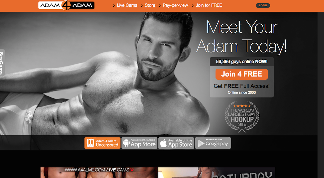
Very nice, keep doing what u doing!!! … btw I want to meet the HOT DUDE pictured in the “Meet Your Adam Today” offer 🙂
Do not like the new format, pics distorted. Like the invisible blocks
Interesting there does seem like a lot of stretched space,but since A4A will not be changing, I guess we will have to get used to the change.
I agree with the wasted space. Everything is to big and I spend more time up and down the page looking at who’s online. Why does everyone try to fix what is not broken and working perfectly well? Bottom line, I don’t like it.
Ugh… Looks horrible on my Note 3….The main web site was the only thing that looked decent of the three options and now this is a mess. As the old saying goes if it ain’t broke don’t fix it! Sad to say this puts you in with the other sites now as too much work to make it work…
The new look sucks! The old way things were condensed and easy to see who was online at a glance. Now you end up having to scroll down the page to see whos online. Before you go and change things, why not ask us what changes we would like to see. Who ever designed the new look did a lousy job!!! How do I revert back to the old look?????
I do NOT like the new look of A4A! There’s too much negative space and some members’ profile photos are stretched out which is unflattering. It is not a good change. Please reconsider going back to the old version or create a new look that’s better than the current one. Uuuggggh
I don’t see negative space, I see positive space. It’s all in how you look at it. Kudos to A4A for the upgrade, although why is the functionality unchanged? There are a lot of guys from this other website chomping at that bit for a chatroom. A4A could have driven the nail into the competitor’s coffin, but instead you went cosmetic only?
bob: that’s the first step:)
Cosmetic…later, more!
I think they new design sux as well all the pictures now look stretched out and dull not really being able to see the pics in a good way.. I also think it’s ridiculous to ask people to try out something new without letting them opt out and back to the older version if they don’t like what they see!!!!
Don’t like was more easy to use the old way abit faster not happy with update :/
The opening mobile options page doesnt allow use of the standard view on a mobile device. It opens the standard page, but all buttons lead you back to the 2 options page. The only one that will function is the standard mobile app view. Very frustrating. The mobile view is good on a phone, but not good on a tablet. Using android, so maybe it is just designed to work on apple devices??
I do not want to sound paranoid but it would be nice to show travel plans just for the city to which you are going. This information does not seem relevant to the place you have your profile. Also you may be negligently setting someone up for his property to be vandalized. I watch the insurance commercials warning about posting travel plans.
I want to use desktop version on my phone. Only one I can navigate well. It lets me sign in but every time I click on anything it brings me back to the screen asking if I want mobile or desktop!! Sucks!!!!
Site looks fine and we just have to get used to it…If it still gets me laid then it’s fine by me!!!!
Just go under settings and uncheck new version, then you will be back to normal.
I’d have hoped the designers would dial back on the godawful electric pumpkin orange in favor of a more subtle, less intrusive palette.
1. Indeed, everything is where it was, spread out over a larger amount or real estate. How is that better? (Rhetorical question. It’s not.)
2. I guess looking at yourself when you enter the site appeals to the vain and self-absorbed among us, but it doesn’t do anything for me. I’m more interested in looking at OTHER profiles.
3. Not true. Blocked user thumbnails still appear in the “Online Members” pages. This is another change I really would like to have happened.
4. Maybe the new site version is improved “under the hood,” but the user experience is not better — just different.
5. As long as the mobile app censors half the site content, it will not occupy space on my iOS devices.
6. Yay for the Fandroids.
The new, gray placeholders are impossible to decipher, and tell us nothing about the profiles they represent.
Sorry to be a Negative Ned, but the new site design is not an improvement. At best, it’s a lateral pirouette. What else ya got?
I hate the new layout, mostly because the page size is expanded. The old layout compacts everything well into a small space, so less scrolling is necessary.
It took me forever to find out where the revert button was, you guys shouldn’t have hid it. For those of you that have not found it yet, it’s under the “alert notifications”, the same page where you turn on/off the alert sounds.
You should make the invisible option available under the old layout, for those of us that prefer it.
You should keep an option for all members to revert to the old layout if they should choose. If you force all of us to the new layout, it will only fill up your inbox with a lot of angry members telling you how much they hate it. …. (deja vu when you brought out the converations for the first time, where members were alerted when their message conversation had been closed/deleted by the other member), which some people took as a silent insult.
If you really want to allow a color scheme change, check out what they do at the gaydar website. Their primary color scheme there is also orange. But they give each member about 7 other color schemes to choose from, and only takes about 10 seconds to change it. You should bring that option here.
For example if someone is tired of the orange, they could choose the layout to be dark green for a4a… I suggest offering 12 total choices of colors to the members. Put a “color scheme” option on the Account Settings page.
I am a webpage designer, and got a bachelor’s degree in public relations, so I know some things about layout and visual appeal.
Sergei: our design team have Master degrees and have been working in design and web for over 20 years. So they know what they are doing!
I like it!
Some people just can’t handle change….always been that way…always will be that way. Nice look to the new version….more professional looking. Keep up the good work.
pageboy50: thanks man! Appreciate it
Or quit A4A….. Don’t let A4A become manhunt
Yeah but your mobile site sucks! Only goes in a loop if you want to pick desktop version.
I to hate this new look . I use my iPhone but do not like the mobile app at all I like the Full Ver. But not I can’t get it on my iPhone. Go back to the old way . Can’t stand the new larger photos.
I can’t google image search photos to make sure they’re real anymore
On the new site I can’t even check on my “on line friends” to see who is on line . And can’t even check my messages it keeps going back and asking me which one do I want “mobile ves. “or “full site ” . I think it is in a loop and can’t get out. I think WE ALL need Help!!!!! Go back to old site …
The new site is nice, larger pictures, the only problem I am having is when you want to chat or send a smile to a certain individual by clicking their picture nothing happens not like the old site where their information comes up so you can chat with that person, other than that I like the set up on the new site.
1: Blocking mechanics
=====================
I would like to suggest not only when a user blocks a person they become invisible to that user but when users block others the blocked party should not even be able to look up the others profile or browse their profile in general search.
I’ve had way to many times someone just make a new profile and try to hit me up and keep bitching.
I like the being invisible feature I would only like to suggest that it works both ways. If I block you I can’t come looking for you and you can’t see my profile either.
Do it Facebook style.
===============================
2: Picture fairness (Pic 4 Pic)
===============================
If a user chooses to use Adam4Adam with no uploaded pictures they should NOT be allowed to see/browse other users pictures period.
If a user would like use Adam4Adam with no face pictures uploaded they should NOT be able to see/browse face pictures other user profiles tagged with having a clearly visible face picture.
To make things a bit more free of choice give Users the ability choose what others can see based on what is shown to them i.e.
User A has 1 face photo, 1 body shot and, 1 full frontal nude.
Say user B logs in and has no uploaded pictures; give user A an option to choose what to show user profiles that have no photos such as:
**These options should be marked for each individual picture (not set to private) in the users profile; pictures by default are displayed to everyone unless checked otherwise**
1.Default Open display
2.Do not display to user profiles that do not have a visible clear face picture(s). (Otherwise display)
3.Do not display to user profiles that have no visible photo(s).
(Otherwise Display)
So, for user A and each of their photos:
Picture 1(Face photo) would be tagged with option 2 but option 3 is available depending on the amount of privacy they would like to express.
Picture 2(Body Shot) would be tagged with option 3.
This way if user b logs in and has no visible photos (of any kind) user A doesn’t have to share any either. This could also be left to default.
Picture 3(full frontal) would be tagged with option 2.
==========================
3.Private photo Mechanics
==========================
I think what would be a glorious feature is a revamp of the private photo option. Before I say anything though, Adam4Adam needs to let users know with different icons what the picture status of other profiles are, if all of their uploaded pictures set to private their needs to be a different thumbnail for this versus not having any uploaded at all and using the same icon.
This is how I feel the private photo should mechanism should work. Say again, it’s involving User A and B. Let’s say that user A decides he doesn’t really want to show off that full frontal to just anyone with any ol’ picture. He would like to decide what users to show it to and when.
This time let’s say that User B has uploaded 1 body shot picture and 1 private photo too.
So in this scenario instead of seeing none of user A’s photos when he browses his profile User B will only see User A’s body shot picture and full frontal nude tagged with option 3 (his profile meets the requirements to view pictures belonging to User A).
However, User A wants change this because that full frontal does have his face in it too so, he sets it to private.
Now, when User B logs in and is browsing User A’s profile he will ONLY see User A’s body shot marked with option 3. The private photo will show up as a thumbnail indicating so.
Let’s say that User B want’s to see User A’s private photo.
So, when user B pulls up User A’s profile he should be able send a sort of request (maybe a button on User A’s profile) for unlocking pictures belonging to User A BUT! upon sending his request for User A’s private photos User B’s Private photos should become available for viewing BEFORE User A agrees to the request to unlock his pictures.
IF! User A agrees, then User A’s picture becomes unlocked and viewable for User B.
IF! User A refuses the request, User B’s Request is canceled and B’s picture is immediately re-locked from User A.
This eliminates the willingness of users to badger others to unlock their photos if they are unwilling to show their own in the first place. Also with making the initiator acknowledge the responsibility of unlocking pictures they can’t dupe other users by uploading a picture of their legs while the other has photos of their full body exposed.
==========================
Notes
==========================
1. The private photo mechanic only applies between two users both with private photos.
2. Users with no private photos can not send requests to users with private photos to engage this mechanic. They will simply have to wait until the other user unlocks their photos.
3. Profiles with all private pictures or hidden pictures are treated as profiles with no uploaded pictures (regardless their picture status there are no visible photos to other users)
4. The private photo mechanic works for all private photos at one instance in user profiles and not individual private photos.
5.Pictures should still be able to be Manually Unlocked if users Choose so.
Yuck!! The new layout sucks. Add my vote for reverting back – the new layout is not an improvement. Too much empty space, have to scroll every screen too much, missing photos on the Last Visits list, poor contrast in colors on the page. Why are changes like this made? And why not give us an option to keep the old format? Or maybe ask before changes are made – perhaps your users may have some better ideas.
Very bad design – it looks like a children work.
Much better the old version – please revet !
Editing note. Below the pictures on a person’t profile it says “Remove him to my friends”. I would probably clean that up a little.
I like the new format, but the images are distorted.
silverdylf: take print screen shots and send to [email protected]
I think the new font when not bold is kind of washed out on the offwhite background. Looks very Ubuntuish
The blog link is no longer at the bottom of the members page… In fact i can’t see it anywhere… I had to log in on mobile to access this. Did you relocate it?
Nice to see you are looking to freshen up, but not a fan overall…
🙂
Bill : everything is at same place, the blog link is still there
So, your answer to “it sucks” is “we don’t care”? What a SHITTY way to do business!
steve K : yeah, when you’ll lear how to be polite and talk properly I’ll check your comment, until then….
The new colors aren’t very “dark room” friendly, when using the new a4a on my laptop in the dark bedroom it strains my eyes because there isn’t enough of a difference between shading and txt///
Please bring back the old format, this new version is NOT user friendly at all!!
avid user: everything is at the same place man!
This is a terrible redesign. I will probably not be using a4a as often because of it.
The redesigned home page is unnecessary. I don’t need to see my profile that often. I need quick access to what I’m looking for, location, and setting up travel.
A pop-up reminding me to update the last parts of my profile is irritating. I don’t want to have my dick size available to everyone, so I didn’t fill it out. I don’t want to have to click out of it every time I log in.
There’s too much dead space. I hate to have to use arrow keys to scroll to see an entire page of guys.
Profile text is in bold for no good reason.
In the profile page, buttons(hide my last visit, etc) don’t always work–sometimes clicking just highlights the text, sometimes you have to click the actual words and not the button.
Ugly colors: dull orange, dull green, bright blue, bright red, dull purple are a terrible combination.
Pictures are of a much lower quality.
Black sidebars outside main area are incredibly ugly and distracting. Even dark grey would be better
Anonymous: Yes we are aware of people like you who don’t accept changes, but hey, we needed that and won’t go back to the old version.
I like it! Although there was nothing wrong with the old site, I believe that “change” is always a good thing, plus all the pertinent information (pictures, stats, ect.) are still there so I’m all for it!
I cant read email once you click on it. I am using an Android. All the buttons skew and tile and then as I mentioned, I can scroll over to read messages.
In the Alert Settings, there’s an option that you can check that reads “Use new version of the site”. If you uncheck it, you will revert back to the original. I don’t know how long this will be an option, though. Hope this helps!
I’ve tried four times and get the same old site every time.
eric, in “my account” there is a button u need to click to have access to it.
Guys, ALL the comments that say stuff like ” you fucking morons why did you change it blablaba” will be deleted. I don’t need to see this! Suggestions, tips, comments are welcome but for god sakes be polite!
Dave
You no longer can save the photos by right clicking on them on a regular desktop version. this can be a bad thing if something goes wrong you no longer can say the picture to the desktop so the police can find it.
Not sure how I missed the blog link…
it’s there now… sorry.
Still not a fan of the overall design. You could end up losing a good portion of your base if you don’t see more positive comments in here. when there are so many negative, it is a pretty good sample of attitudes. People are resistant to change by nature, but being vocal about it isn’t, so that may mean something. It has happened to other sites…
And that’s just my non-designer of websites but pretty normal surfer opinion. and you know what they say about opinions.
Good luck with the changes…
How about putting up a poll in this blog…
Question: Are you enjoying the A4A new design layout?
Yes — Loving it.
Indifferent — don’t care either way.
No — I prefer the old layout.
This poll is worded in a way that actually favors the new layout, but I am betting you will get 70% or more that say no. Also you should have a poll counter that shows how many votes have been cast. You can use that user’s IP as the register of votes, so that they would not be able to vote again (unless they used a different computer). I would bet you would get over one thousand members voting in this poll.
Im sure the new design is nice BUT I primarilyuse my phone for this site and have NEVER liled mobile apps. I would sign onto the desktop app before and now when I do it on my phone, it will sign me onto the desktop version but as soon as I try to choose ANYTHING on the page, it kicks me back out to ask if I want to be on moblie or desktop. What gives? Ive already chosen what version I want to use. Even choosing request desktop version within my 3 different browsers gives me the same results. PLEASE FIX THIS…
It appears that blocking a user does not make them invisible. I can still see them on the user list just can’t open their profile.
Sorry all you guys had to be the Guinea Pig but thanks for the warning.
I won’t be ‘upgrading’ unless forced to, like Apple Corp forces you to do eventually with its ever-devolving apps. (I only use a desktop).
I only wish I could block the ‘live sex’ / hookers that show up at the bottom of the m4m website. It feels like some trashy guy is lurking outside my window looking for money.
🙂
I just noticed you added another profile to the rows (5 instead of 4). That makes things much better. The profile pics are not stretched anymore and you get more profiles per screen. I like that blocked members are now invisible. I think everyone will get used to the new look. My only suggestions would be to make the fonts a little more bold and highlight the last visits section a little more. Thanks for your work.
thanks Dex!
wow. the new design hurts my eyes
I do not like it. Please revert back to the old version. ” Don’t fix it if it ain’t broken”
I can’t view my messages…. this sucks alot
Not a fan of mobile version wouldn’t let me use desktop view would keep asking pick mobile are standard I picked standard soon as I pushed anything asked again and again and again. Wouldn’t let me do anything until I pushed mobile. Is there a way around that I hate mobile site for any Web page always just to squeezed in and crowed.
Don’t care for the new version at all. Too bright, too large, too spread out … too bad. Please, please, please let me go back to the original version or make the option available. Didn’t know I would be stuck once I went to the new version. YUK!
Jared
uncheck the new version box in alert settings under your mailbox to revert back to the old version!!!!
Hate the new website. if your on mobile it ask you if you want mobile or standard hit standard but when you click on my friends or email it repeats the what do you want to use . Its all screwed up. Why fix something that wasnt broken? Guess so someone will have a job. Put it back the way it was
The picture upload now doesn’t process and I cannot upload a main photo..
Hey guys,
We just pushed a couple of fixes out. Pictures are now sharper, there’s more profiles per page of search results (my bad, it should have been that way yesterday). We have a whole bunch of smaller things coming. As we get your opinions we’re looking to see what you the majority wants.
We’re a very small team so we don’t have the resources of a Facebook to test everything on every device and screen available so keep the feedback coming. Email [email protected] and I promise you that I will read them.
Thanks,
J
Oh do not like the new site..want the old back..it doesn’t let me do the search every time i hit “search” it then will not let me do the selections…everything else works..not liking all the dead space…
Mobile won’t work on my android tablet. Keeps sending me back to the “choice” page and never to the page I want.
The mobile choice loop was an issue this morning. I’m being told that it was fixed a few hours ago. Please let me know if not.
Um remember me isn’t working for me. I have to completely log in every time it’s not remembering my website ID/alias.
I’m using Google chrome on a Vista Home Premium OS
Problems with new site:
1) Background looks too pink on my desktop:
Really? do you have to pull out that old stereotype?
2) When looking at members online in main window,
Old site had 4 photos across, which fit on my screen
New site has 5 photos across, which does not fit
and I can find no way to change it
3) When looking at an individual profile,
Names do not fit on buttons,
such as “add him to my friends”
4) names do not fit on their buttons
5) Picture in individual profile view tiles (repeats)
multiple times
6) Non standard width for descriptions;
so if you adjust width of window
to get it to look right for one individual profile,
everything changes when you go to another
and gets out of kilter again
(i.e. description box drops below the main pic section
instead of being just to the right of it)
7) too much blank, unused real estate on each of the pages
and cannot shrink windows to have side-by-side views
(i.e. main window and individual profile window)
open on the desktop at one time
8) Does not look good on my android Galaxy S5 either,
so it’s not like you designed this
to look good on my phone
9) Thank goodness I found a way to switch back to old view
I don’t want to look again at the mess you made
You can’t create saved searches anymore. The site freezes every time I do, so I have to close out and re-login. Also, please let us go back to clicking the inbox, instead of on an email to get to the inbox button.
The search feature isn’t working – thanks!
Hi,
when you send a message, you have to scroll to find the send button, but on Chrome it doesn’t scroll all the way, you have to double click the window to enlarge it to full size in order to see the send button.
I have to admit to really liking it! looks great
Thank you for the ability to go back to the older version… Things are working much better nowc4 me… I appreciate the choice.
Ugly color palette and lots of wasted space. Time for beta v2
So, the new site, for the most part, looks alright. However it makes things difficult when the whole site is suddenly in bold except for words/links (profile names message contents etc.) I would say enlarge these so that they dont look like partially loaded spam ads circa 1995. and I would say you have a well designed page, that looks like it belongs in the second decade of the 21st century 🙂
Why do graphic designers always do work that only other graphic designers will love? Consider your audience first and foremost. The thumbnail photos are way too big. It would be fine if it were just faces, but there are too many anuses and dicks and things I do NOT want to see at first glance! If you stick to this layout, then you have to change the rules to faces only for profile pics, or g-rated. You should anyway. It just makes everyone look cheap and available. Or is that the point?
I’m glad I at least found out how to go back to the old, but how long will that last?
Graphically loos great but function wise it sucks!
You have “timizone” around the settings, so fix the spelling, please. I learned from trying to work with a web designer that they have all these rules that they follow, that aren’t actually valid, like having a huge blank space on each side of the page. They have many stupid conventions.
My biggest disappointment is: LAST VISITS. The old version you can see the pic of the person who last visited your profile. The homepage seems a bit washed out on my computer…too much white space.
I find the delete trace bar work poorly , i have to click it 3 to 4 times b4 it work,but I do like the larger pics
My only issue is that not all 16 profiles fit in the “box” correctly, I have to scroll very slightly to the right to see all of the 4 in the right most column. I’m using Firefox as my browser, so it may be fine in ie, chrome, safari etc.
Webmasters: I feel I like the flow of the new format better and I’m just glad see the site change a little bit. Kinda was sick of looking at the same thing for the longest time.
I wish the site had more of a “sleek” feel to it like the image you have at the top of this blog post. But the update is step up for sure. I get what everyone in previous is saying about the so much negative space but I can actually read things a lot better rather than everything being squished together.
Someone did comment on not having an Instant Messenger – I do miss it but the old messenger was kinda clunky so hopefully if it makes an appearance again I’d like it to load a little better seamlessly.
Thanks for a change in scenery A4A and the hard work.
A feature I kinda want is to have a PG filter so I am not immediately hit with a dick on my screen. It gets a little overwhelming sometimes and when I am ready I can switch it over when I am ready to go that far with a guy.
Looks like the site has taken a huge member hit drop. Usually about this time of day, there be 25,000 to 30,000 more members on.
WoodGuuyNC, there is 100,000 guys online. We didn’t see any drop compared to last friday.
Don’t worry everything is under control, thanks for checking!
Thank you so much for fixing it. Much better now!!! You are the BEST!
Looks great guys! A long overdue and welcome change. Great job keep up the good work. Screw all the haters.
It looks fine to me
although overall I’m not a fan of the changes I gotta say the quality of photos appears to be a lot better
Please see the attached screenshot regarding the MAILBOX page.
As you can see the DELETE SELECTED button needs to be aligned with the other buttons. It’s off putting that it’s on it’s own line. This should be a simple matter of fixing the margin/padding/alignment.
http://awesomescreenshot.com/0183rm9n2c
As someone also said the horizontal scroll issue needs to be corrected as well for the MEMBERS ONLINE pages. You do have to scroll to view all of the members in the grid.
I’ve attached a screenshots of this as well.
http://awesomescreenshot.com/0d43rma89e
You may want to consider shrinking the size of the left navigation menu. This might help with the horizontal scroll issue. There is a lot of negative space in this area. Please see the screenshot at: http://awesomescreenshot.com/0d63rmam01
Other than that I think you did a great job! I love most of the negative space, it makes the site seem bigger – the old site seemed a bit cramped at times.
DVM Meetup I sent this to our designers.
I like the larger size despite the empty space. I don’t like going directly to my profile when I log in, it would be nice if you could set your own entry point, but barring that I would like to go directly to men online and work from there.
Pictures are distorted and have to scroll to see the 15 guys per page.
I liked the old layout.
Yay dont have to see the blocked guys.
Wish I could block all the guys that have TMC in the profile. It is a thinly veiled attempt of free advertising for the bath house in Tampa.
I think the gray color makes the site look cheap.
One other thing you might have missed. Right click is disabled in a user’s profile. Which I think is GREAT btw, but still available on the main guy’s online page so the public pics can still be right clicked and downloaded.
I like the new version.
While we have your ears about website improvements, how about returning the ability to post links in private messages. I realize the inability is to reduce spam, but some guys profiles are spam anyway where they have “all my pics are at adam4pix dot com” (btw NO ONE GO THAT SITE PLEASE), the reason I bring it up, as I am tired of seeing profiles promote that site, yet you won’t allow authentic members to provide links in private emails.
Some of us have links to additional pictures of us not on a4a, stored on other sites, that we could share with the guy we are chatting to. This would reduce guys having to send an email with a photo attached.
The report button can still be used, so if someone posts a spam link in a private email, they can still be reported. I actually suggest that when you deem someone to have sent a spam link in a private email, that you do a 14 day ban of their IP address. This will reduce spam even further. If after 14 days, they create a new profile, and get reported for spam again, ban their IP for a month.
Chrome Version 38.0.2125.104
Mac OS X Yosemite
Left column has some wasted space- There’s a 100 pixel gap between the edge of the frame and the text column. Needs to be utilized better.
Profiles on the right side are cut-off.
Would be nice if the profile picture sizes were dynamically sized to the browser’s window size, so that you can see the entire grid along with the previous / next buttons fit into the window. Let the mouse over enlarge the pictures.
I would like to see 2 different icons for no uploaded pictures and no primary photo. I liked the old text version better since you could see the three reasons why you can’t see the photo of a profile.
When viewing a profile (in a pop-up window) couldn’t you make the “X Close” link look like a button? You’ve already done it for the “Next” and “Previous” buttons, why not do it for “Close”?
Thin horizontal lines to break up between the stats, description, sexual preferences, etc would be nice instead of paragraph breaks.
change is difficult. yes, it is strange but not so different as to cause a problem. people need to lighten up and enjoy your work. it is YOUR site anyway and all we need to do is to thank you for letting us play here!
Overall, I really like the design and look of the site. Good work!
I do think there is a lot of empty space that could be tightened up a bit. Make it a bit more consolidated.
Other than that. Looks modern and cool. Have not experienced any bugs so far, which is a good thing.
Good work.
Cheers,
Carlos
Love it!!! Great new changes.
Where are all the Members, I cant find them?
I don’t like having 15 profiles per page. I have to scroll to see them all before I go to the next page. The old pages had 12 profiles and would fit on my screen with our scrolling. I know it’s a little thing but it is annoying.
Not a fan of the new design.
Sorry to say this but I don’t like this new design AT ALL! pics are stretched, so you can’t tell what person really looks like, the new page doesn’t fit properly into the screen, I have to scroll not only up and down but also side to side to view all the profiles. Visually not very appealing, almost causes pain to my eyes. why fix something that’s not broken? it was not a good idea to downgrade your site’s perfectly fine design and call it an “upgrade”.
I hope you are bringing back the chat feature. It is faster than waiting for email upon email to go through. Thanks.. found a great guy on your site…
While i’m not a fan of the new design, I definitely prefer it over the old one which was straight out of the days of dial-up.
With a few tweaks this could be great.
I like the new look, it’s a bit more modern and refreshing.
But the intentional distortion of photos is unconscionable. You make thin people look fat and vice versa. As a graphic designer, my clients would fire me if I did this to any of their images. Why do you think this is acceptable? Or is this a glitch you will be fixing? You really need to.
It’s a good start, but…
1) I don’t want to see my profile first thing when I login. More useful would be a layout that shows statistics (mail, friends, etc.) and last visitors, as well as the standard control panel type of options that are there now.
2) Colors are a bit heavy. There’s nothing wrong with #fff, or #eee if you want to tone it down slightly. You’re going to get rabid feedback no matter what, so redesign freely and show graphic mock-ups to designers and developers — everyone will have an opinion, of course, and you’ll never please everyone.
3) You’re using Bootstrap for the layout, but not all the components, and jQueryUI, but also not completely. I recommend dumping Bootstrap and using Sass with Susy or Bourbon for your layout grid and jQueryUI for your widgets, if necessary. Your code will end up much cleaner and easier to maintain. It’ll also load faster.
4) Although it’s a pain, you should audit every script and stylesheet; remove what doesn’t need to be there and optimize what you can. All css files should be combined and minimized so only one file is served. Same thing with js. (Sass will make your life easier for css and Codekit on the Mac is great for compiling and minimizing.) The site will load faster and server load will be lessened.
5) MSIE conditional classes in the tag will help you target older MSIE and load additional scripts or polyfills only when needed.
6) Modernizr is your friend.
7) I’m happy to see the new site is trying to be responsive, but it’s not there yet. Responsive is difficult to do and get right. I know from experience.
8) “Saved Searches” and “Last Visits” should be links to those pages. There’s no need for an additional button.
9) There needs to be consistency in the button design. Set no more than three sizes and make the font size, styling and padding proportionately the same. They should all have the same border radius.
10) Quick Search should remember the settings from session to session.
11) I like the idea some had above that you can specify what type of user can see your profile based on their photo. The same settings for that could also be used to sort the photos in a search or quick view. (Face, PG, R, X, Locked, None)
12) Traces could be better handled by having a default that can be overridden. ie: Default to no show, but have a button show on the profile to leave a trace, or default to show, which would have a button to remove. The trace could also be made fancy by leaving a stock badge/message. See gayromeo.com for an example of trace badges.
13) Putting all of your site standard images and icon badges (radar, mobile, etc) in a single sprite will also speed things up.
Does it show that I’m a web developer?
There are some definite CSS issues on Chrome on Mac. I would take advantage and change the color scheme to something less halloweenish? Some of the tan/sand/beige elements don’t off enough contrast and are hard to read. For example in the Members Online gallery the Near Me link is hard to read. I would take a good look at Google’s Material Design
Not sure what the fuss is about other than the fact that people do not like change. The color scheme is basically the same as it was with the exception that everything isn’t so orange/peach which I’m cool with. It’s clean and not so bright which I actually like. I also seem to see the pictures are much more clear..more HD so unlike most others, I don’t have an issue with the new layout. I love it.
This new site is a step in the right direction, guys, but it really lacks the feel of a professional, polished design. The layout needs to be massaged onto a grid (960.gs has some really good examples of gridded pages,) and the logo needs a good, hard look.
Good fixes at the tightest way too small
Appreciate the effort to redesign the site. Older site font style and spacing were perfect. I didn’t see any reason to change. If you really redesign the site, retain font style, spacing, compactness… those are the pluses in the old site and missing in new site. To understand what I am saying, see a (lengthier) profile page in old and new site format side-by-side. Similarly, compare left panel/pane/frame with links members online, new members, visitors,etc in old and new format.
good work in trying to update.
cleaner, less clutter, and larger graphics.
a few problems / suggestions…
• the default seems to stretch (widen) photos that i assume don’t meet a certain pixel count… looks strange.
pretty sure you’ve already been alerted to the issue.
• the blinding orange format seems to have been lessened / screened back, which is good. how about an option that lets each user choose a different color scheme like gaydar.uk does? some of us have color perception issues and choosing something as simple as a different color would be a huge relief.
and… some of us just don’t like orange 🙂
(i do)
~thanks guys
Its FAGALICIOUS!!!!
Love the new look keep up the great work guys. Very user friendly
Quality of pics is better, but it is a bit too white. The old color scheme did seem to be easier on the eyes…maybe it is just me.
The new site colors are blinding and too bright. Please.
I changed over to the new style and found it much more difficult to use. My main problem though is, once I logged out, I almost couldn’t get back in. I had my screen name saved, typed in my password, and when I clicked the LOGIN button, absolutely NOTHING happened. I’m guessing this is a Java button, so for your information, I’m using Java 8.25 and IE9 (because IE11 is such a piece of S**T). SOOOO, I tried Google Chrome and lo and behold, the LOGIN button DOESN’T WORK IN GOOGLE CHROME EITHER!! If you do some refreshing, clicking the back and forward arrows a bit, and stand on your head just right…you can sometimes get back into the site.
Gave the new layout a shot in both its PC and mobile versions just now. Over all, not a lot of change when it comes to User Experience. Didn’t find any real new or or improved features. The “airy and open” look is a bit of wasted space for me; prefer the older compact version so there’s less scrolling. Wished the site opened in Members Online (hey, isn’t that why we’re here?) page instead of the Profile page, but that’s not new. And I really do miss the Chat feature that disappeared “in the dark of night” several months back.
If the largest new feature has to do with BLOCK, that’s not a feature I regularly use.
A suggestion for A4A … when you wish to roll out site improvements, pick 24 semi-regular users and ask them to preview it. Make sure they’re not part of the “Good Old Boys Club” on the site; make sure they’re first time reviewers. In the case of this rollout, early feedback brought a torrent of negative heat and not the best responses in the Blog. Perhaps that could have been avoided with a beta test.
Hey glad you’re trying to improve the site! It’ll always be somewhat of a learning experience for all.
Hunter0500: we did that already, thanks
Can the mail be fixed, because the saving feature doesnt work like it did with the old mail…..if I save a message now and I continue emailing the person, the message will be saved, but now the part I wanted saved
DEAR A4A, I SORT OF LIKE THE NEW LOOK!! YOU KNOW YOU CANT PLEASE EVERY, ONE ON HERE!! IF YOU DIDNT RE-DESIGN THE PAGE THEY WOULD HAVE SOMETHING TO SAY AND NOW THAT YOU HAVE RE-DESIGNED THE PAGE THEY ARE STILL FINDING FAULT!! I SAY THANKS A4A FOR A NICE NEW PAGE!!!
Your design team as been doing this for 20 years? Certainly doesn’t show that. I would be more selective in your so called design team because the site is a mess. Now when you click on profiles the wording is gone. The site is stretched out as if it was magnified, the wording is huge as if it’s for someone with bad eyesight who’s not wearing corrective vision. I am just saying as is.
JD: U seem to think to re-designing a website with millions of member is easy …
Our ” so-called team” like you call them, are very intelligent and have done websites from big companies before, they totally know what they are doing. It’s not to do what YOU personally want, it’s doing what will be BETTER for MILLIONS of members from around the globe. Old, youg, rich, poor, chinese, indian, american etc…
Thanks for your understanding
Dave
Aesthetically is not my issue. Rolling over a profile that
impinges by size the person you were looking at is annoying.
Can you add a red dot to persons you have already sent to? It
inadvertently can lead to embarrasment or worse, being blocked, just for looking.
Great you have found a way to keep the current page viewing of members for a minute or so.
What REALLY needs the overhaul is the aged, lacking list
of questions with anachronistic limited pre-set replies.It
is vague, boring and why can’t we state our own nuances???
Remind members on phone and radar leaving in middle of convo
maybe to “flash” that member a reminder to return for new
incoming….talk about “Lost in Space” !
READ your replies, evaluate, and make it MORE MEMBER-USABLE-
Too many members either don’t post pix or just ignore the
questionnaire….if it can reflect a member as they would
want to be seen.
Sure will be back with more~ Aries Ram 11
I am OK with the new design and have not come across any issues yet.
I like the larger thumbnails and the look of the new page,
my largest complaint, the inability to enlarge pics in the profile, and unable to right click and google search for the pic on the web
the new app does not allow you to keep being logged in , every time I log in I have to retype my name into the box and even if i check the REMEMBER ME BOX , I still have to reenter my name
I don’t mind it. Not that much of a change, actually. Change is good every now and then. Now, if only someone could “update” my love life, I’d really be happy!
Too much white/dead space (between photos, profile text) that looks pretty bad on the 27″ iMac and even worse on the 12″ PC laptop. I have to scroll through the screen to see anything. I never use the mobile app so maybe the update was designed for the mobile user??
At some point we’ll all be forced to the new version. I’ll stay with the old look until that happens and then, make a decision if I’ll hang around. Unlikely, though. This might signal my jumping off point. Not fatal; just might be time to move on.
Oh yeah: The block function is stupid. Silly grade-school men and boys who think they’re self-important. I’ve never blocked anyone, but weak-minded men and boys send me an unsolicited nasty email (out of the blue!) and then block ME. WTF? 🙂 I love people with low self-esteem.
How do I search for guys online/ near me ?
I like it. Thanks for all the work I know you guys put in it. Change is scary, but I think it looks great.
I read the blog that stated that the designers of the website have 20 years exp. that may be true but do they actually use the site and know the aspects that make it good for us? Also I don’t want to see the measurements of a guy in the metric system, it means nothing to me.
you guys all complain to much!!!!!
it looks nice i like it alot 🙂
The new menu looks nice. However; HIERARCHY, HIERARCHY, HIERARCHY. Should I say it again? Work on the hierarchy because there isn’t clear separation of sections when everything is the same size, same color, same font style.
Every time I login I get the message that “your email address has not been verified”. I have done what I thought I needed to do various times to have my email verified…what do i need to do? Too, too much dead space-way too spread out
Says blocked guys will be invisible but I am still seeing them.
In explaining why you had to update, you give only two reasons; one is that you are going to add things to the site, OK, that makes sense. Two is that it needed a fresher look or updating. Don’t you realize that the customers couldn’t care less if it has a “brand new look” or not? I think you and the designers did it because YOU wanted a new look. The new look is way overboard. The new orange and black looks like a bad Halloween motif. Somehow it’s much harder on the eyes as the orange is too bright and then you throw in black and white and it vibrates. Also, navigating is much harder than before. The site is hard to understand and not user-friendly, but that’s obvious from all the negative feedback you’re getting.
On the mail page you have buttons over the mail and again under the mail. Doesn’t anyone look at this and go… “that’s redundant?” Also mail button colors are garish, theres absolutely no subtlety with the new site.
When I go to pay per view I can’t navigate back because the only option is HOME, but it doesn’t take you HOME. It takes you right back to the pay per view. Doesn’t anyone test these buttons and functionability before a launch?
Also, I hate to beat a dead horse but the negative space is way too much. Everything looks tiny with lots of empty space around it. It it wasn’t orange and black it would look like a US Government website.
The new layout isn’t bad–it just doesn’t wow me! I’d rather have something like new features like bringing back the instant messaging feature. It would make trying to find the right guy for sex or a relationship a lot easier!
I like new things and understand the learning curve. I’m willing to give this a shot and see how it plays out. That being said, I prefer the desktop version to the moble version. I have been forced to the moble version on my iPhone 6, even though I selected desktop version. There does not yet seem to be a way back. Please include a desktop preference in the settings. Thank you!
Has the supporter price structure changed? I don’t remember paying $30 for just a month. Also if you want the $10 for 1 month, you have to auto rebill. I don’t like that. Allowable pics have been decreased. Some of mine disappeared.
Site looks better but like others said, there is dead space and lots of scrolling.
I do not like the look of the new site I believe i’d echo the comments about negative space, although i’ve never heard that term. My reaction is that the pictures and graphics are way to big, and the rest of the screen image is to oversized to fit on the screen. The old version is compact, shows a lot of information in one view, and can be visually navigated much easier. From computer dispaly adjustment, the resolution is supersized, giving a bigger macrosized view, rather than a smaller screen view, with higher resolution and more screen image. ….. in any event, from my non geek perspective, the existing old site view is much better, i tried the new one and switched back immediately. Maybe the new view is better for cell phone mobile image use, i don’t use my phone as a camera or puter, i strictly use laptop, and from that use, the new site is inferior.
I have to admit I was very critical of the new version but it looks like they have made improvements to the look such as how the pictures look.. They don’t look all stretched out and distorted anymore but my one complaint would be that I don’t like when u hit the “my account” button it automatically goes to you’re profile.. I’d rather not see that right off the bat… Keep up the good work A4A
I like the lighter appearance and more pics on desktop version while on my android tablet. I do have trouble with all the text showing on the edit profile page and no way to scroll down or up in the box. The extra space does create a distraction. Touch selecting on my android is difficult due to size of boxes but that’s a setting on the tablet. Keep improving!
C’mon guys, give it a chance and make some positive suggestions that will make it better.
Since my original post, I have noticed a couple of small improvements. So I do have to give the powers that be props for that. I understand that you are trying so thank you. You seem to be taking our suggestions very seriously. So keep at it, you are on the right track. I feel that you are determined to create a better site and I’m glad that you are taking our thoughts into consideration. So I do have to say… Good Job and Thank you.
3. Blocking now makes the blocked person INVISIBLE!!! (yayyyyy!!!)
I tried this feature. It only blocks the photo/profile. His online status still shows up on the site. I assumed blocked person invisible meant that I could no longer see that he is online, nor he see that I am online. Otherwise, it’s exactly like the same old site setup.
Otherwise, everything else is OK.
I do not like the new look. I hate that it does not remember who I am and it goes to my home page and not to men on line!!!
I’m adjusting to the change , but dick size as the first question every time I log in??? It’s not my first concern.
Need to change time stamps to match current times now that Daylight Savings Time is rolled back.
I like the new site but you need to make links the entire button (colored area) and not just the text. I think that is why people are saying, “…I have to click 3 or 4 times for it to work…”. They are likely just generically clicking in the colored space versus clicking specifically the text for the button/link whatever.
The fact that you had to acknowledge the rude bitches that use your site says a lot. Lol.
Please, in future updates consider enhancing user friendliness with ways to filter guys like those you are acknowledging. It’s never fun to come across those guys.
You need a Banhammer. Shut’em down.
I think to have a community chat area would be something different. Being able to chat with a group of guys at one time.
I have chosen NOT to fill in a few of the entries in my profile. I don’t mind the first time I revisit my profile to be reminded that you want me to fill those in. But I certainly don’t need to be reminded EVERY time I return to the site. I made my choice and I want it respected.
It’s too ambitious for a website used for hooking up. It should be minimal and user friendly. It should be clean looking and straight to the point. And it would benefit from a sleek design. None of which this design offers. I’m not a hater, but I think you need to start from scratch. Less is more mentality. No need to be flashy. And honestly, I know it’s been up a day, but you really need to reevaluate the talent of the designers. Too many mistakes.
James : The site is the same as before…
Buttons at the same place…
I dont understand what you’re saying…
Doesnt render at all well on my android device…navigation doesnt make sense any more….I had tabs at the top previously…the layout is poor. How can I go back to the old web layout? Is that an option??? Help please.
A few fixes I hope are addressed. It doesn’t facilitate the remember my profile on this device feature on mobile devices particularly iPad. Also it would be nice if the site didn’t shut down my music in the background every time I click on any a4a function or refresh the page.
I want to get back to the old site,
the previous design is better and simple
Forcing me to choose a zodiac sign every time I sign in because my profile is “incomplete” is just plain stupid. There’s a reason it’s not part of my profile: it’s nonsense. There is no basis for astrology and it’s highly inappropriate to force it on users.
There’s horizontal scrolling in the iFrame that shows user thumbnails. That you designed and programmed that rather than reflowing the layout indicates just how bad your decisions for this design were. Being a “small team” is just no excuse. I work at a small company on a small team, and we do it right, not pretty.
While it looks nice, I switched and now can’t log in on my iPad air what’s up with that so now can only access through my phone unless someone knows how to switch when u can’t log in
I like the changes, only issue is have to constantly reset for distance and doesn’t save my screen name after I log out.
I think the new site is basically good, though here’s a small adjustment that might make it much more pleasing. The way it is now, one has to scroll down to see the third line of profiles, and to see who’s me. Why not spread things out wider, using all that black space to the left and right, so that everything is seen, neatly, without having to scroll down. Just a thought, otherwise it’s fine.
*who’s viewed me
It isn’t looking so good on the iPad when you use a web browser such as Safari.
Gentlemen
I love the update it is clean and crisp,pics come across much better fo me Thanks and keep up the good work I love it
I’ve been using bi/gay sites/chat since 1998, and I probably used gay dot com the most, but after they massacred their beautiful blue/black layout and went to the current, tacky design they have, and removed all their community chat rooms, one of the best websites (they) turned into a laughingstock. I haven’t even used their site in a year, and I used to be logged in there hours per day.
I am not aware of any website that has community chat rooms for each major area anymore, now that they removed it, so I am proposing that a4a add 101 community chat rooms.
That “1” would be for the international community outside the U.S. — with potential for more international community rooms in the future.
The remaining 100 rooms, offer a North and a South chat room per state.
For example, Northern Connecticut chat room, Southern Connecticut chat room. Northern Nevada chat room, Southern Nevada chat room. Due to geography, some states may be better suited with a West and East, for example Western North Dakota chat room, Eastern North Dakota chat room.
This could be a springboard for eventually more chat rooms, if it turns out as a success. And if it does turn out as a success, probably 50% of the current members that stayed at gay dot com will leave that site and come here, as they probably have been hoping for the past year that local chat rooms would return. This would be a way for you to slap gay dot com, and they deserve a slap for the way they alienated their members with their poor choice of changes.
I do realize that it would involve a lot of time and money to create the new rooms, but it would bring more members here, and that would encourage many of them to donate money as supporters, so you would get money from those that choose to donate. And even members that have been here for years, may decide to donate for the first time, if they see the community chat rooms added.
Technically gay dot com does not even get the credit for the community rooms. They stole that idea from IRC (MIRC). Which is a reason member involvement on IRC dropped massively once gay dot com started up. The furst guy I ever met on a date, I found on IRC — so it’s an idea worth investing in.
Speaking of investing, does A4A or its parent company (if you have one) have a public offering on Wall Street — if not, consider it. Or is that idea too far away in the future to be reality in the near-term?
I like the changes. The site is more up to date and professional appearing. It’s still A4A, with the same men and same ways of searching.
What I like.
It’s brighter.
The layout is easier on the eyes.
It’s more fun to look at. The color scheme is sharper and sexier.
It’s not a lot of change, so I don’t have to relearn anything.
It’s a free site, so I don’t feel like I should ask for much. A4A is the best gay hookup site on the web.
If I was going to make a wishlist for future versions… which would be asking a lot….
I would love to see it match by characteristics or criteria. I could go in and meet men with similar interests, not just sexual. If, say, I wanted to meet someone who likes to read, likes sci fi, likes to garden, doesn’t drink… I could put in those traits or likes and shazaam, there he is.
I am not into zodiac, and have been resisting adding my sign. I might add it so the program doesn’t ask. That’s just me, not a big deal.
Not reading all of the comments, but for me, it’s a great sight. I almost never hook up, but that’s not the site’s fault.
The site is kind of a pain to navigate around. You have to go back and forth to check mail and browse where it was all in front of you before.I am all for change but this doesn’t seem to be a feasible change for the better.
It seems pretty clear that a4a is committed to this change, whether the users want it or not. Don’t forget what happened to Gay dot com (remember them?) Everyone jumped ship and moved to a4a right after the Gay dot com website changed. They didn’t listen to their user feedback. Degrees and prior work experience don’t always add up to the right answer. Listen to your users. We all pretty much hate the new site. Are you tracking how many of us have reverted back to the old layout? You should.
While you are on the subject of categories for your users, could you please refresh your ‘race/ethnic’ categories to include more, such as indian, that you mentioned above? Or pick some standard list where you either do skin color (if you must) and ethnic background separate…
It has a clean, updated look; I like it! Will there ever be a way to search profiles on a keyword combined with location?
I am really liking the new direction. I am a web-designer myself. I understand growing pains. I saw a few tine CSS issues here and there making your main frame scroll left-right a tad, but I feel you are headed right direction now. I would implement a bit more bootstrap and using grid for responsiveness issues. main body right sidebar goes a long way… Keep up the good work. Ingone the negativity. You are giving them a basically free site with minimal nags. Joke em’ if they cant take a fuck…
I like the new site. The only thing I don’t like is, you can’t tell if you’re last visitors are online. They used to have a frame around the picture when you put your arrow on them if they were online.. Now you can’t tell unless you go to their profile.. Other than that.. It’s pretty cool.
Dam i also just made the mistake of checking out the new design and i wish i could go back, where is Dorthy and Toto? please oh please god let me go back to the old one? i will give you A for effort but you should do more focus groups and round table talks. before trapping people into this. Sorry for being a whinnying but its just does not look or work, as good as the old.
Sorry
I don’t like the new version it is so user unfriendly.
The new design is… okay in theory. The design is very inconsistent though. The whitespace is just off everywhere. Random line breaks, buttons with and without padding, badly vertically centered text, buttons not aligned with dropdowns, etc.
Most annoyingly, I have to scroll in a lot of places where I never had to scroll before.
I deleted browser history and now the new version is all I get..I go to mailbox alerts and there is no option for go to old version….which i had five minutes ago….how do i get it back to old now??:???
Steve, I think you cannot go back. But you’ll see it’s almost the same, just more modern.
The buttons and photos are all the same place…
When you increase the browser size to more than 100%, it looks awful. You really need to test things out so that it works well in all browsers at all sizes. This new design is not well thought out.
PLEASE add an option to profiles to see any message history still in mailbox between the two of you; this is standard on most other sites. I have to resort to sending a first mail saying ‘Hi!’ just to see if I have chatted to the guy within the last month or so….
I finally decided to give the new version and I hate it. If I can not revert back to the old site, I will delete my account. The system has gotten a lot less useful in meeting people and these changes to not attract me to the service. The instruction above to revert back to the old site is not accurate.
I have an iPhone 6plus. For some strange reason I can only view Half of a person’s profile page. I have to turn the phone in landscape mode to see the entire profile?? I cannot scroll to the left or right in order to view the entire profile page. Is there a fix for this ?
TJ; I reported it to our team
The new version does not show mailbox? Every time I go to mailbox it brings me to alert settings. I cannot go to my mailbox to view my old messages. Need help with that
mike:are u sure? Did you email [email protected] ?
How can I go back to using the old format on the site. I’ve gone into my mail settings looking for the box to check for going back to the old version and can’t find it.
Would really be great to also have the logout box back at the top of the page rather that having to be viewing my profile and having to scroll down to the bottom of the page everytime i have to logout
a4a web guys, please listen to the user’s comments. there is a significant number of people not happy with the new design. I switched my main profile and I can’t switch back. I really don’t like the new design, e.g. it does not have “logout” option on the top of any page (now buried at the bottom of the profile page). when I look at the old design, I wish I didn’t switch (actually a blog page was saying you can switch back, but this is obviously not true anymore). that bug on profile page (only half of the page visible) is present on android chrome too
Mario I reported the bug on android to support…
Thanks
Whoa! I really wish I hadn’t click the link to go to the new site! It’s really not an enjoyable experience. 🙁 I wanted to like it, but that’s not happening. Sure wish you hadn’t removed the link to go back to the old site. It seemed so much more streamlined and easy to navigate. The fonts were also much better on the old site. Some of the new fonts are not easy to read. Sorry, it just seems like sub-par programming.
I don’t like the new version. If you won’t let me go back I will delete the account and cruise elsewhere.
I too clicked on the new version thinking I’d be able to go back to the old one.
I was wrong. Not very happy about it. The new version nowhere near as clean a look as the old version.
PLEASE bring the option back!
There’s too much wasted space in the new site and it’s not as compact on my desktop. Way too much time scrolling. I can’t switch back! Why not?
The instructions to switch back to the old version no longer work (there is no “Use new version of the site” box in the alert settings).
How can you revert back to the classic version?
you can’t
dangit I accidentally just changed to the “new” version and I liked the old one so much better! 🙁
Hello Earth , Hello Adam4adam CEO, Hello anybody home???!! WE don’t like the new version ! Don’t be cheap, we pay membership and we want old version back, or make changes on this new crappy version, where are your web designers???!!! Hello anybody there?
Hi Marc, early January we will have an even newer version. The old versions won’t be available anymore. We invested lots of money to bring you guys great site and app for 2018.
I do not like the new version. Too busy and not nearly as user friendly !
Hey Rick, the buttons are all at the same place. We simply added few elements here and there, and made it more “pretty” but the main design is the same.
I cant see anyones or even my own photos when i click on profile…???
Javier, are you on website on computer? Mobile? or on the App?
Absolutely terrible. Slow, waste of space. Why take a perfect loved website and ruin it. Tried to make it look like Scruff. It isn’t.
How can i get back to the old version? So very bummed.
scruff doesnt have a website…. so not sure what you are referring to here…
Worst thing you could possibly do is change something people like and that worked? It might be great as a app but it really is a bad idea for a desktop. black or white background really with all the colors available i the world and all the non sense on the left side that stands out more now and could be used as a drop down give me members pics not options on the left side. Do you guys really need to frame all your great members pics with massive quantities of useless junk?
We had to change it for server reasons. And the design needed a big update to stay competitive in 2018 and relevant. You will get used to it in 1 week. All the buttons are at the same place, almost nothing has change except the messaging system, which is faster.
Dear Customer Service, I’ve been using a4a for several years and I loved the old website and all of a sudden I lost it and I was automatically switched to the new version. I’m a senior citizen and I have difficulty using this new version. Would you please tell me how do I switch to the previous version ? Thank you in advance.
Hi Roobin, you cannot go back to old one, we are sorry about it. The servers that hosted the old site is no longer in function that is why we brought all users to the new version. Let us know if you have questions.
Not crazy about the new look. I am looking for a way to get back to the other version. I don’t see the switch back to old version option anymore. Did it get removed? I may delete it if I can’t get back to the easier old version. Maybe they should try going back to the drawing board.
If i could figure out WHERE .mailbox alerts resides, i would take your suggestion and switch back to the desktop version that is more intuitive to me. This new one’s just filled with- what computer people who change things always do – an assumption that what your brain says is easy to follow, is so for others. This is not so.
Hi Kevin, check out the notification setting page : https://www.adam4adam.com/alerts
Also feel free to tell us what exactly you don’t like? We understand that things are harder to find at first, it’s normal with any changes, but after few days you will see that it is nice and simple.
Is there anyway to show only the pro ads who are online? Clicking on pro used to only show the pro ads online in your city. Now it lists everyone, whether they are online or not.
New version is horrible. I used to be able to see guys near me. I used to be able to see guys that were close by. There should be a way to sort by distance so you see guys that are in your town but in your local area,
where did the saved messages go?
Saved messages are marked with a green arrow.
help i find the new design so hard to navigate & the old design site so so much much easier to navigate? is the old interface completely gone now in 1-1-2019? if not then how do i find it? i try going to mssg alerts like it says from 2014 postings & find no box to uncheck saying use new site beside it?!
Hey, the website is almost the same but more modern. Buttons are at the same place.
No you cannot go back to old one.